
35 Actionable Tips to Reduce Shopping Cart Abandonment Rate
You’ve got amazing products that you know are going to be flying off the shelf immediately. “They're gonna be selling like hotcakes”, you tell yourself, rubbing your hands with anticipation, eyes closed tight, happy smile on your face. Why not, after all? Your drop dead gorgeous e-shop is a piece of art AND a killer converting machine. People are gonna come and they’re gonna stuff their shopping carts like crazy. You’ve got this.
This is the moment of truth.
But then… Strangely… Inexplicably....
Nothing happens.
Well, not exactly. Something did happen, and there was some action going on after all. People added your product to their shopping cart (action 1) — and then they left it to never come back (action 2). That’s what we call shopping cart abandonment, and trust me, these three words are a nightmare come true even to the best online retailers. Whether you're an e-commerce pro or a humble beginner, it's the same struggle.
Shopping cart abandonment rate is as high as 68.63%, says Baymard Institute. This means that almost 70% of your shop visitors that have already gone as far as adding products to their carts and almost becoming your customer, will never be your customer.
But as I always say, never say never.
There’s a number of ways to help reduce high shopping cart abandonment rate. One of them is to understand why it actually happens. Have a look at this graph by Statista that explains the reasons why potential consumers suddenly drop out and leave without paying.
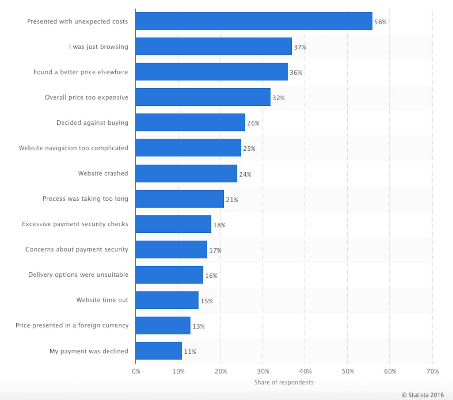
As you see, most of these issues are preventable, but it will take a tweak or three to resolve them.
In this article, I have put together an ultimate list of tips and tricks that you should definitely try out to optimise and boost your sales conversions and improve the shopping cart abandonment rate.
Fighting shopping cart abandonments rate:
Before Abandonment
1. Be transparent about your costs
Remember that time when that flight from a low-cost airline turned out to be expensive? With extra charges for tax and fuel, an additional credit card fee, and a sneaked-in travel insurance that the system chose for you by default, the ticket came out to be not so low-cost in the end. And the majority of people would never EVER buy that ticket. Why? Because once you see the final price, the whole thing starts to feel like a scam. There's no trust in the product anymore.
56% of people abandon their shopping carts when presented with unexpected costs during the checkout process. However, if people are given a proper heads up about how much the product costs, they’re more likely to buy it — even if it’s more expensive.
So what does it mean? Simple. Be transparent from the very beginning and disclose all your costs on shipping, taxes, etc. In other words, be honest with your customer.
2. Offer free shipping
You might have heard about the power of “free” before — Chris Anderson explains it very well in his book that is called, well, “Free” (which I highly recommend). Chris shares a famous case study of Amazon that rolled out free shipping across all its national sites if the order exceeded $25. This was implemented with a mere hope that, if you’d originally planned to buy only one book for, say, $15, a free shopping offer would entice you to buy another book that would bring the total purchase cost to an amount higher than $25. When this feature was rolled out, second-book sales were skyrocketing everywhere. Except from France.
Instead of offering free shipping for the second book, French Amazon was charging 20 cents for it. And while admittedly, 20 cents is ALMOST free, it still appeared to be a huge deal breaker.
As David Bell, Professor of Marketing at University of Pennsylvania, has put it:
For whatever reason, a free shipping offer that saves a customer $6.99 is more appealing to many than a discount that cuts the purchase price by $10 — @davidbnz
Charging for shipping is a HUGE conversion killer. After all, half of merchants out there are already offering free shipping. Customers are so used to the idea of free shipping nowadays that 61% of them will even consider cancelling the order if they have to pay for delivery, says Shopify, referring to a ComScore study.
Another study, carried out by E-tailing Group, has found that unconditional free shipping is a number one criteria for making a purchase. And as if this wasn't enough, another study, this time done by Compete, discovered that free shipping encourages 93% of online shoppers to continue shopping and purchase even more products. Ninety. Three. Per Cent.
I rest my case.
3. Be clear about your return policy
Have you ever experienced a so-called “buyer's remorse”, when you suddenly deeply regret having bought something a minute ago? Some people have that (I definitely do!). Interestingly, however, the anticipation of remorse can sometimes cripple us even before we make a purchase.
To prevent this from happening, give your customers a clear understanding of how your return policy works (tip: it should be free).
Katey Ferenzi from BigCommerce is giving even more useful tips on how to successfully write a return policy in this article. In a nutshell, she recommends to:
— never hide your policy
— never copy paste
— never use over-complicated English
— never use such words as "you must", "you are required" or (the worst of all) "we are not responsible for"
Instead, she advises to clearly outline what customers will expect from you, mentioning if you exchange, offer store credit or give a full refund if a client were to return an item.
4. Reduce the average checkout steps
In 2012, Smashing Magazine looked at the top 100 grossing e-commerce websites and found that on average, it took customers 5.08 steps to complete a checkout. Now, that’s way too many. The checkout process should be short and sweet, otherwise you risk losing 21% of your potential customers. So, if you’re wondering how many steps a perfect checkout process should have, the answer is: the bare minimum. Only ask for essential information, such as name, email and delivery addresses, and payment method, and never make people fill out the same information twice.
On average, it takes customers 5.08 steps to complete a checkout.
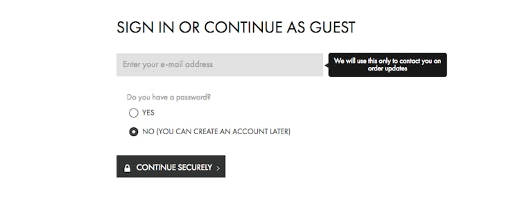
5. Don’t demand too much
Registration shouldn’t be compulsory. Most people already receive myriads of emails and don’t want to be forced to sign up for Yet Another Newsletter. A majority of us have tons of logins and passwords — creating Yet Another One often seems to be more than we can handle. This means that registration shouldn't be compulsory, it should be optional.
Can you remember at least one time when, in order to buy something at a regular brick and mortar store, you were obligated to sign up for a postal newsletter? I bet "no" is the answer, because these things never happen. You don’t need to sign up for anything when you’re buying a perfume in a regular store at Sephora, for example — so why would you need one when you’re buying the same perfume online?
I could mention many more reasons to offer a “guest checkout” to your customers, but perhaps the most powerful of all is that by allowing customers to check out anonymously, you will significantly boost your sales. Guest checkout accounts for 16% of total deals sales, reaching up to 43% when it comes to mobile shoppers.
Calvin Klein knows this well, and that's the reason they enable a clean, simple guest checkout opportunity for every potential customer.
6. Have a clear progress indicator
A small tweak, and yet a huge game changer at the same time, a progress bar is basically a finish line that motivates people to complete the shopping race. Let people know that there’s the light at the end of the tunnel! Not only will this alleviate the worry of being all caught up in a long-lasting checkout process, but it will also reinforce the goal they set for themselves (i.e. make the purchase) and make them want to achieve it.

A progress bar by Net-A-Porter
7. Make your content shoppable
While there are many reasons you should be blogging as a brand, the problem with traditional blogging — or traditional content marketing — is that it’s hard to see direct sales from it.
Think about it.
From the moment you discover an article, to the Aha! moment when you realise that you want to buy the product mentioned in it, to the Finally! moment when the product already lies in the shopping cart, you have to go through a number of never-ending stages and processes where many potential customers get “lost in translation”.
On the contrary, if your content is directly shoppable, i.e. if people can buy products directly from it, people can add items to their shopping carts right away — and as a result, buy more.
8. Remove distractions
If you want to keep people focused on completing the order, you need to remove all distractions that urge people to click elsewhere, such as the menu navigation, unnecessary calls-to action, etc. After all, our attention span is smaller than one of a goldfish, remember? And according to scientists, it’s only getting worse.
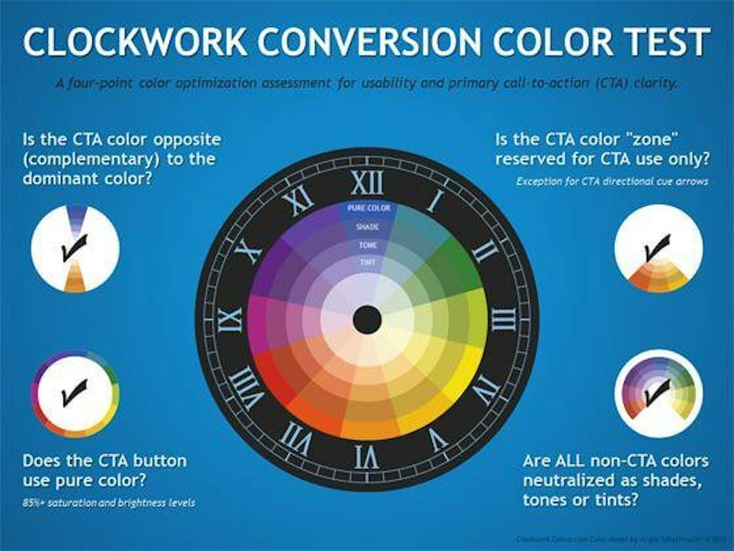
9. Be smart about your calls-to-action (CTAs)
Since we mentioned CTAs, take a moment to really think if your call to action really screams “Click me!” to your website visitors. Does it attract enough attention? Does it have a powerful look? I personally love this “Clockwork Conversion Wheel” that helps to determine the perfect colour for a perfect CTA button:
10. Improve speed
Every second that you make your customer wait decreases conversion by 7%. In the meantime, two seconds of delay during the transaction process can increase shopping cart abandonment rate up to 87%, which is 20% above the average. So yes, page speed does play a very important role here.
A two-second delay in load time during a transaction process increases shopping cart abandonment rate up to 87%.
How to improve the page speed? Here are a few ways you can start with:
— Optimise and compress your images so that they become as light as feathers
— Minify CSS and HTML work
— Get a better web-hosting service
To get a better understanding of your speed issues, go to Google’s PageSpeed Insights, GTmetrix, or Pingdom that will give you a full list of things you should work on.
11. Improve website navigation
“Where am I?” and “How did this happen?” are not the type of questions you want your customers to be asking themselves when they shop on your website.
People should be able to navigate around your website as smoothly as possible. If they don't get where to click and how to proceed, you're losing a deal opportunity.
12. Improve your mobile
"Mobile is on the rise!” you hear this on every corner. And yet, mobile cart competition rates are 5% lower when compared to desktop and tablet, says Formisimo, reminding us all, again and again, that we’ve got to improve on the mobile front.
Are the product images too small? Are the buttons impossible to click on? Is the checkout process a pain? If you answered yes to at least one of these questions, then it’s time to get a grip of your shop’s mobile performance.
13. Make sure you’re getting relevant traffic to your shop
If your shop is getting lots of irrelevant traffic from a completely different target audience, will this have a negative effect on the cart abandonment rate?
Well, OF COURSE.
Traffic quality is a major contributor to whether or not people find your product interesting enough to buy it. So make sure your marketing team is pulling the right targeting triggers and attracting the right audience!
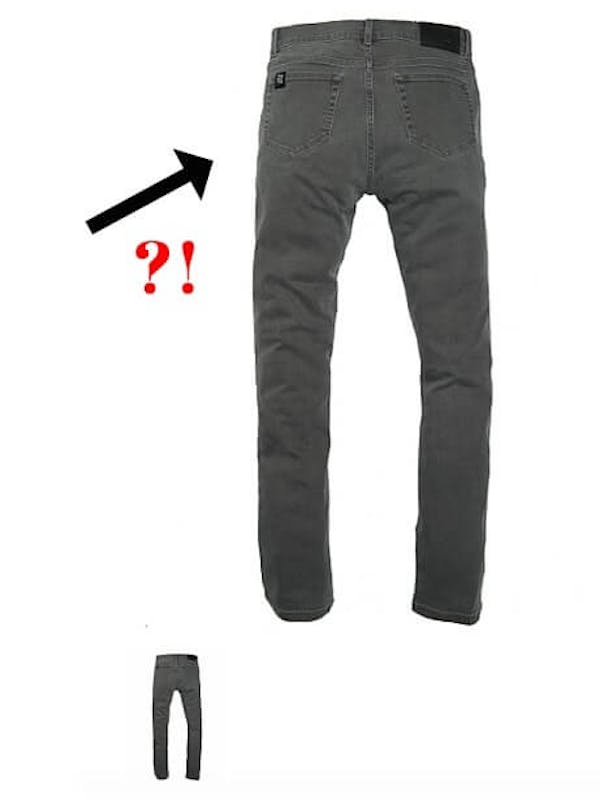
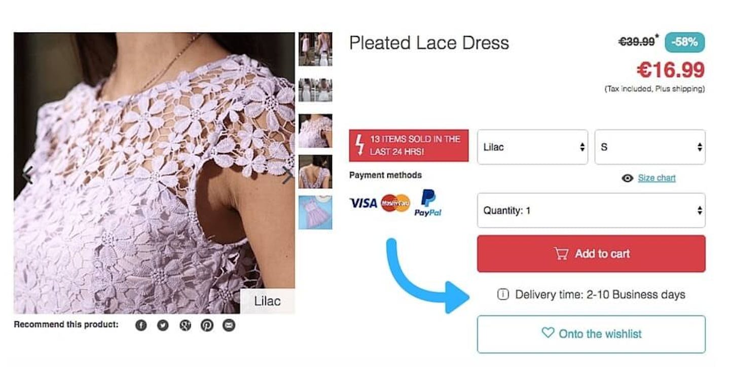
14. Use more images
Have you ever had a customer that has returned your product claiming that it looks nothing like the picture?
I hope not.
But in case that has happened, it was probably because you didn’t display enough images to actually show what your product looks like. This is also one of the major reasons why lots of people wouldn’t buy it in the first place.
I recently stumbled upon an online clothing store for men, where they were selling jeans showing just one single picture with the back view only.
No front, no right or left — just backside. Talk about awkward.
Adding more images showing off extra details about the product would definitely make it look more appealing. It's a no-brainer, really.
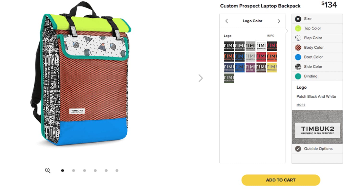
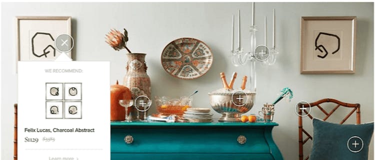
15. Add better, more interactive images
The connected consumer study by e-tailing found that there are few things that online shoppers find to be particularly essential when they check the product out. Here they are:
— High quality of the image
— Ability to see the item in a different colour or style
— Ability to alternate views of the item
— Zoom-in functionality
Timbuk2, which makes “tough as hell” messenger bags and backpacks, is a great example of what you could (and should) be doing: the pictures are dominating the whole screen, they’re zoomable, high-quality, can be viewed from different angles, and they give you a precise understanding of how your backpack will look once you customise it.
Another great solution is creating 360-degree images that display your products from every possible angle.
16. And even better — add videos
There’s only one thing better than high-quality spin images, and that’s video.
By the end of next year, videos will account for 69% of content traffic worldwide. Videos are currently the most popular dish on the content menu today, and they are becoming increasingly important in e-commerce, too. Why? Because they are dramatically improving sales conversions.
When zappos.com, for instance, started to use videos on their product pages, they increased their sales up to 30%.
“They [Zappos] use the video to describe, use and demonstrate the products with real Zappos employees and not models or actors. Those videos are said to have a sales impact of 6 to 30%”, says Mark Robertson in his article.
17. And even EVEN better — add UGC
If you thought that there's nothing in the whole world that beats the might and power of videos, I'm here to prove the opposite. UGC, or User Generated Content, is the hot new thing: according to SEMrush, 86% of businesses use UGC. It is a huge, and yet still pretty much untapped, marketing opportunity that unveils unique angles of your product, adds an extra layer of personality, and makes people relate to it a little bit more.
18. Is your product page persuasive enough?
There is one single goal you should have in mind when you build your product pages, and it’s NOT how to sell your product.
But what else are the product pages made for? I hear you ask.
Here’s the thing. Bad product pages are built to say “Here’s the product, sweetie. I do hope you like it”. They have large product photos, reviews & testimonials, discount codes… and yet somehow, they're still missing the right note.
On the contrary, good product pages are built to say “Here’s how your life will change if you buy this product”.
Feel the difference?
Your product page should first inspire and then persuade people to make a purchase because they will be convinced that it will improve their life.
Remember:
People don’t buy products. They buy better versions of themselves.
19. Have a section for sales and specials
If I told you that 47% of online shoppers buy only discounted products, would you create a section for sales and specials? Probably yes, right?
A recent study has found out that the majority of online buyers are looking for a section that identifies sales, special offers, and discount codes. So when you're running a sale on your shop, make sure people notice that — put it on the front page.
20. Use coupons
While the first part of online shoppers are all about catching discounts, the rest are all about using coupons. Websites like RetailMeNot, GoodSearch, and Coupons.com, among others, provide coupon codes on a regular basis. Just like that.
Image from RetailMeNot
Your job as a retailer, however, is to provide a special spot in the checkout process for people to insert the code — just like that:
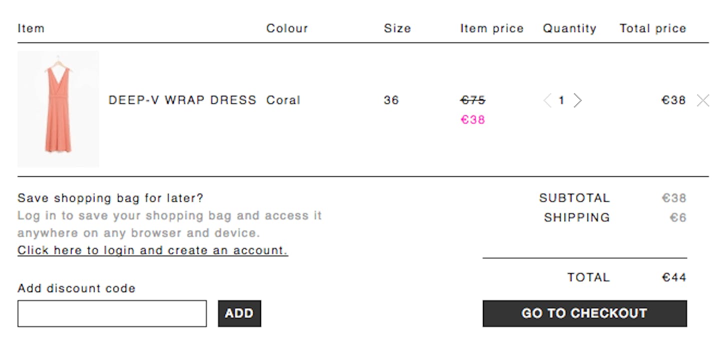
Example from & Other Stories
21. Allow customers to review and edit their cart…
…as well as get the details of products added at any time of the checkout process.
Many checkout systems are built in such a way that it makes it impossible for customers to go back and see if they’ve added the correct item. So as soon as they hit the “back" button, the shopping cart gets emptied out and all their efforts go in vain. And how many customers would be willing to start building it from scratch again? Probably none.
22. Persistent shopping cart
Nothing is more annoying than creating a nice little shopping list, saving it in the cart for later, coming back to it in an hour, and reading “Sorry, you shopping cart has expired.”
Time is precious nowadays, and not many of us will have enough of it to go through the long process of re-creating the shopping cart from scratch.
The solution? Persistent shopping cart. For at least 30 days.
23. Enable people to save their “wishlists”
Harsh truth: 37% of people are just browsing your online shop, having no purchase intent whatsoever (or having a very weak one). So to get them back to the online shop and make them go through an order, you could install a “wishlist" feature, which would allow people to safely store the products they loved without feeling the pressure to buy them right away.
24. Make sure you don’t go out of stock
What’s even more annoying than an expired shopping cart is having every single item go out of stock. While it is a hard job to correlate the demand and the quantity of your products, it seems unfair to take the product out of the customer’s basket once it was already there. I know it's easier said than done, but try to make sure you don’t go out of stock too often — or at the very least, send a gentle reminder to inform a customer that certain items in their shopping cart are getting sold out. That will make them hurry up a bit.
25. Use limited time offers
Now, this is a trick you should be implementing with caution. By throwing a limited-time offer, or a "flash sale", you'll create a feeling of urgency which people normally respond to very promptly.
According to behavioural psychologists, "urgent situations cause us to suspend deliberate thought and to act quickly", so by having a very short-term special offer, customers will be motivated to take action — and buy the products.
26. Show that you’re trustworthy
Any online shopper will have a lot of doubt when he opens his wallet for the first time in order to pass his credit card information. So here's what you have to do: address every worry and eliminate every question that the potential customers might have regarding payment security.
Forbes recommends to put security features everywhere, so that people know that their private information won’t get leaked. Here's an example from Asos:
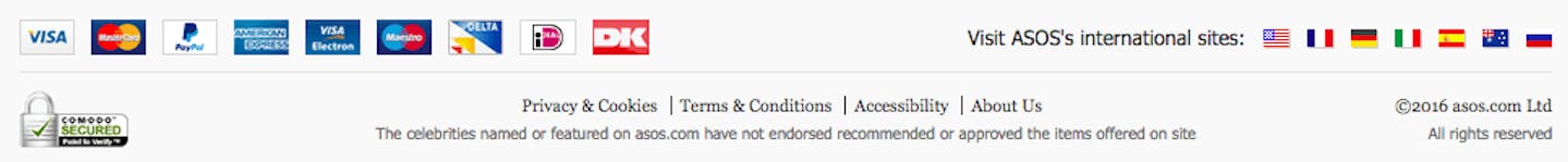
Additionally, having a clear privacy policy, displayed phone number, and live support chat will also help you look more trustworthy.
27. Add reviews for social proof
Humans are social beings, and, more often than not, they base their decisions on the opinions of others. Sure, that dress/suit /frame or whatever it is that you're selling looks nice, but were people actually happy with it when they bought it?
Topshop provides all the social proof you'd ever need as a customer by enabling both social sharing and public reviews of each and every item they sell. In doing this, they make people feel that they've really made the right decision.
28. Offer multiple payment options
People pay in all kinds of different ways, and your job is to ensure that they’re able to do it. Every popular payment method is a must: VISA, Maestro, MasterCard, PayPal, Google Wallet — you name it.
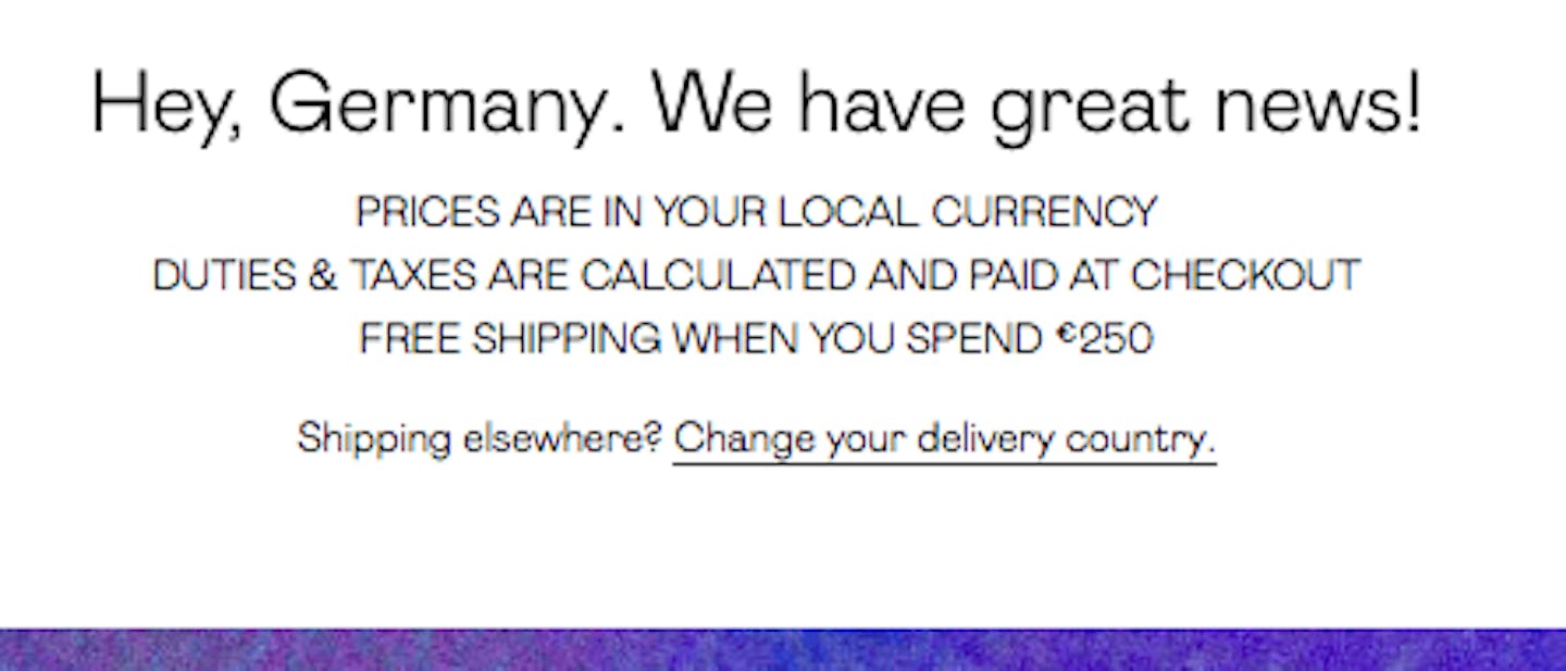
29. Show local currency
If your shop runs international sales, make sure that your international clients can pay in their own currency — or at the very least, that they’re provided with clear currency conversion information.
Here's a great example from Nasty Gal: with one clear, simple message, the brand lets its German clients know that they won't have to convert currency in their heads when they shop online.
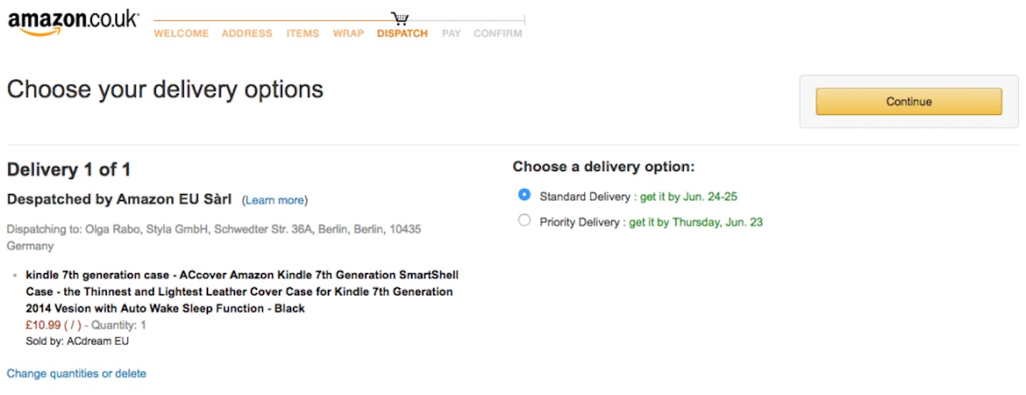
30. Allow delivery tracking
Make it clear to the customers when they will receive their purchase before they actually buy it.
Look how Amazon does it: before the final checkout step, they let you pick a delivery option, allowing to choose between standard and priority, and give you a clear idea of when the item will finally be at your door.
Alternatively, you can also give people heads up before they even add the product to cart. Check out this example from Lesara, for instance:
31. Make sure that delivery service is fast enough
Three weeks of waiting for a parcel dispatched from my own home country? NEVER!
A survey carried out by Dropoff, the same-day delivery service from the U.S., says that slow delivery time directly correlates to abandoned shopping carts. In fact, 60% of consumers decide not to purchase from a retailer because of slow delivery speed, and 46% of respondents said that they expected companies to deliver faster than they did a year ago.
32. Show helpful error messages on the checkout page
People sometimes make mistakes when entering a form field. We all do. So why not be helpful and point that out? If they don’t see why the checkout isn’t going through again and again, they will eventually give up and you will lose a customer. So be nice (or else) — let them see they’ve made a typo!
After abandonment
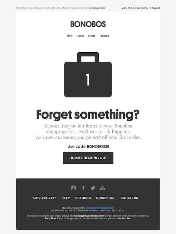
33. Send an email reminder
Even when you’ve done everything you possibly could, the truth is, some people will still be abandoning their shopping carts. So when you’ve reached the plateau with the on-site changes, it’s time for some off-site practices. One of them is a gentle email reminder, which can save 17% of churned customers, according to Big Commerce.
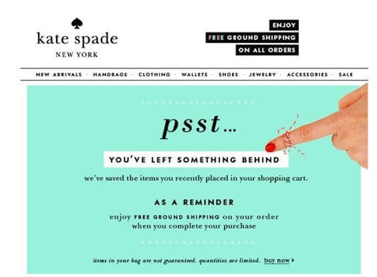
Now, there are numerous methods of crafting the perfect cart abandonment email. Some are keeping it clean and simple, like Kate Spade.
(Not how the brand is giving a heads up about the free shipping.)

Some are keeping it sharp and smart, like Madewell.
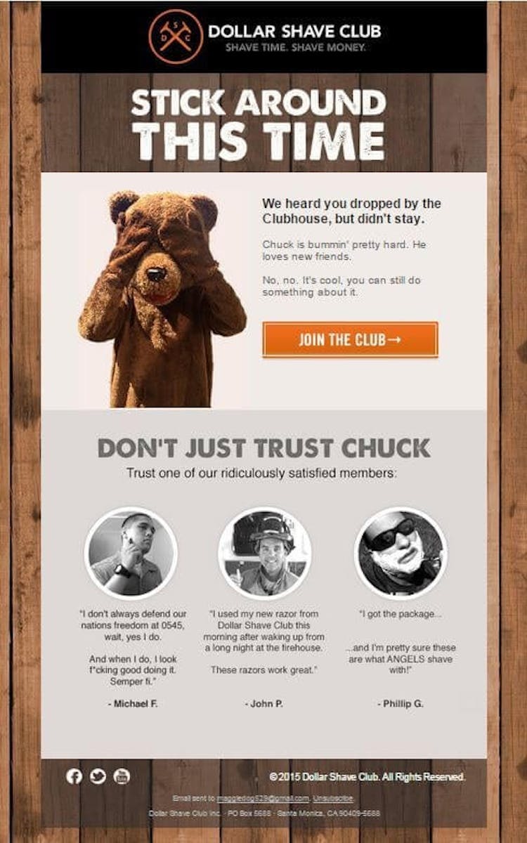
Some, like Dollar Shave Club, are adding some humour to it.
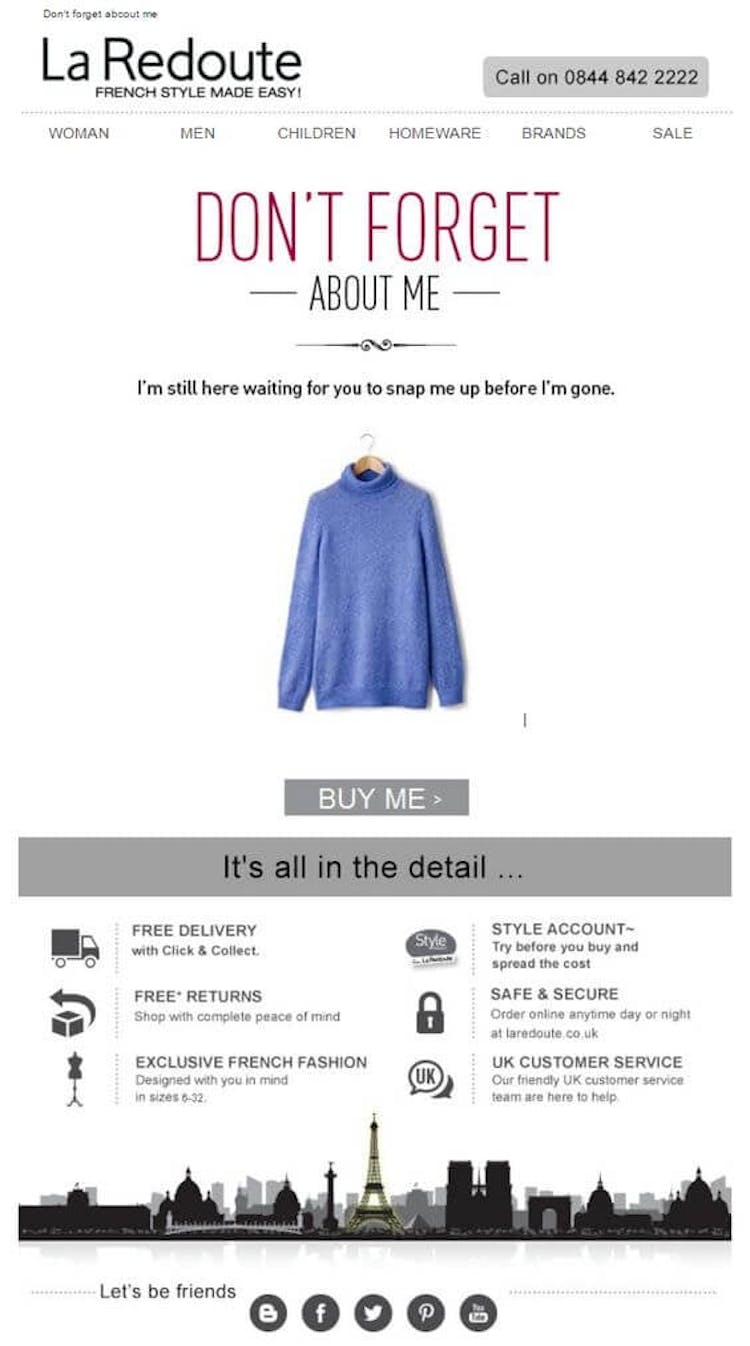
And others are playing it personal, like La Redoute.
34. Offer a discount
To make your cart abandonment emails even more successful, you could offer a discount or a special offer, such as a coupon code, or free membership to a loyalty programme, or a matching item — the possibilities are endless, really.
Use this sparingly, though, as you don’t want your customers to be abandoning baskets for the purpose of getting a discount every time. So perhaps, do some email segmenting before, sending particular offers to different types of customers.
35. Do some re-targeting
You ever browsed anything at Amazon — say, a waterproof iPhone case — to end up seeing ads for different iPhone cases all over the web? That’s called re-targeting.
According to AdRoll, only 2% of online shoppers convert on the first visit to an online store. Retargeting, however, brings you back the other 98% by keeping track of people who visited your website and displaying your highly-targeted ads to them as they surf the Internet.
Conclusion & Takeaways
A Forrester study found that 89% of consumers have abandoned a shopping cart at least once.
With stats like this, it becomes obvious that fighting cart abandonment rates is an ongoing process. It never ends. You have to be constantly improving, always moving forward, and regularly testing and experimenting to see which triggers pull the most effective results. So here goes my last tip, perhaps the most important one:
Keep going. That’s the only way to improve.


Subscribe to our newsletter
Sign up to receive top e-commerce content, Styla updates, and more!